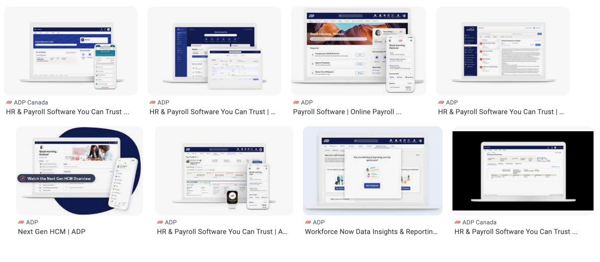
We were the Beacon Design System team and we had just finished an awesome design system upgrade for the Lifion Platform, a business unit of ADP. Executive leadership at ADP saw our upgrade, its success and wanted it. So Beacon became the new ADP OneUX Design System and I faced the challenge of unifying a product ecosystem with a new design vision.
Role
Sr. Product Designer
Team
Director of User Experience
UX Researcher
Sr. UX Designer, Patterns
Deliverables
Components
Layouts & Patterns
Vision Screens
Design Principles
Design System Website
Mentorship
Duration
6 Months
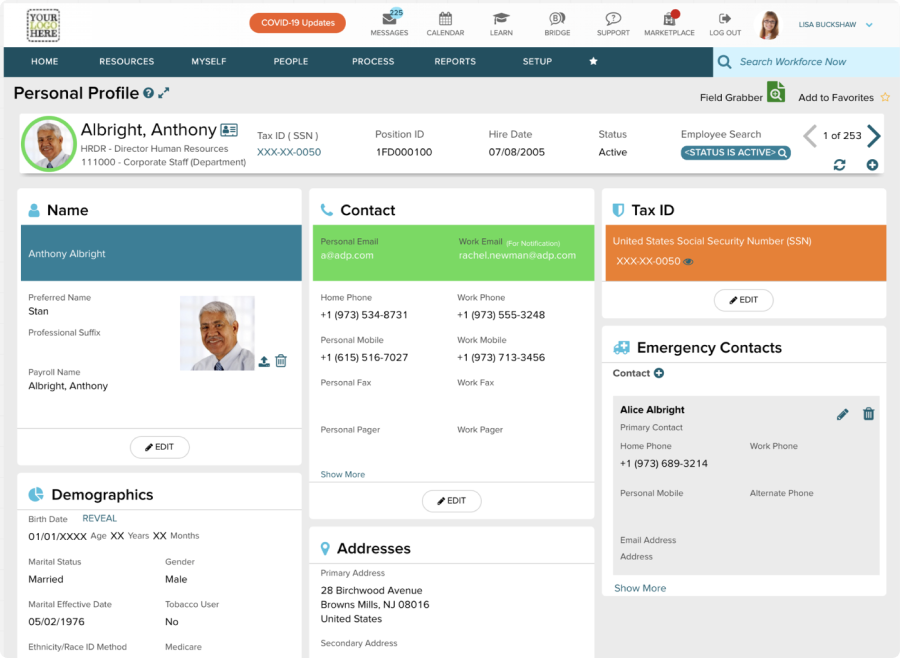
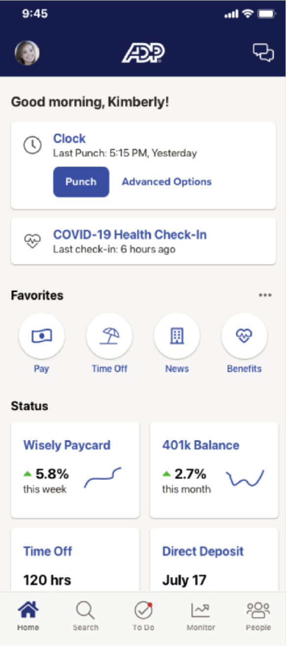
Before
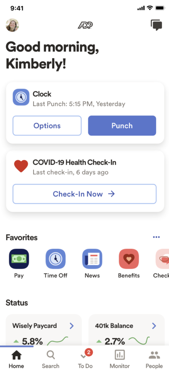
After
Use Beacon 2.0 as the foundation for growing OneUX Design System.
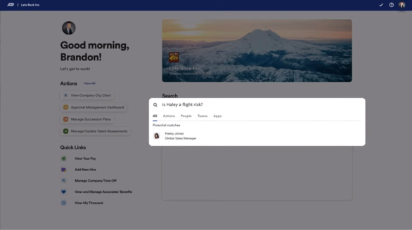
Create and deliver a vision to unify all digital products across ADP.
Empower and inspire designers across the org towards new design thinking.
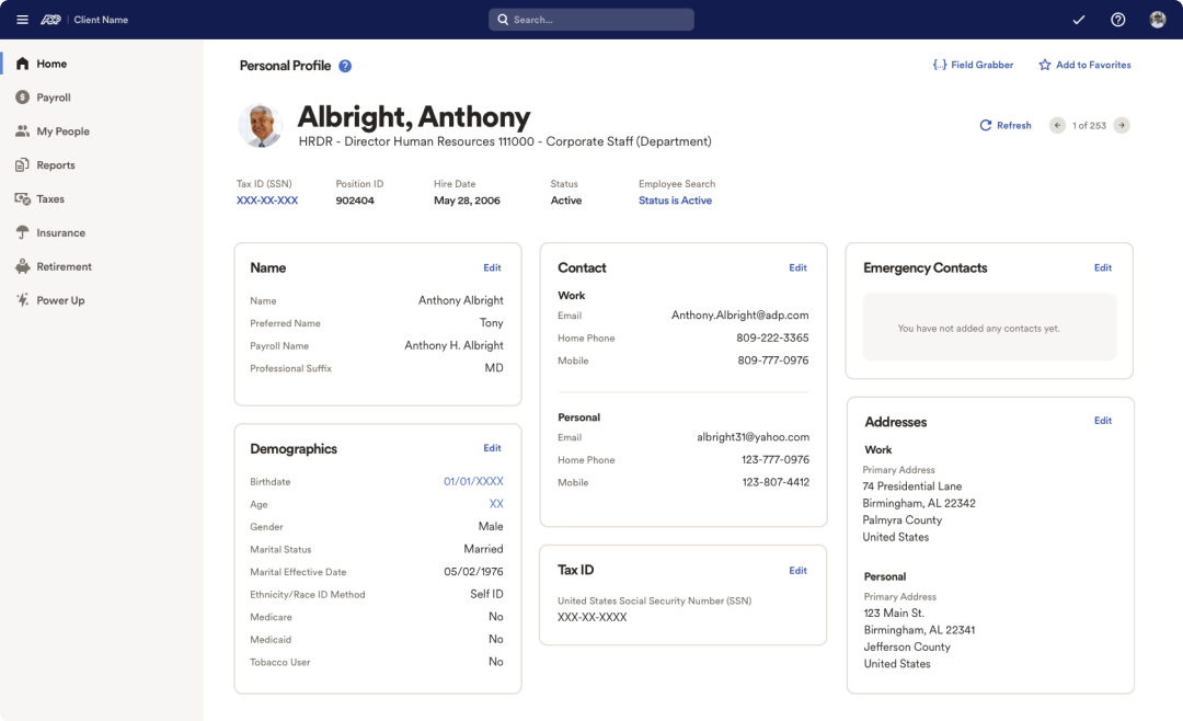
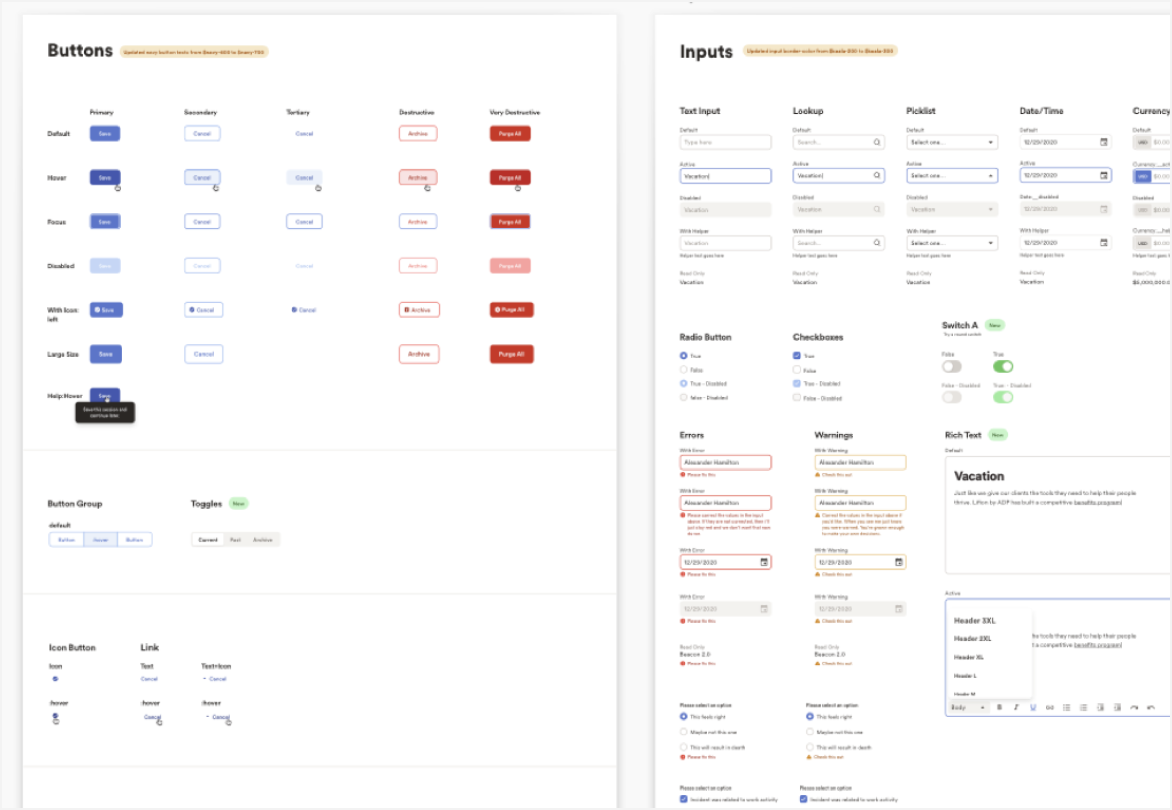
To recap, we had just released a complete design system upgrade, which included a new vision for the Lifion Platform. I led the redesign of all visual elements, core styles, and interfaces. This was the foundation for the OneUX Design System.
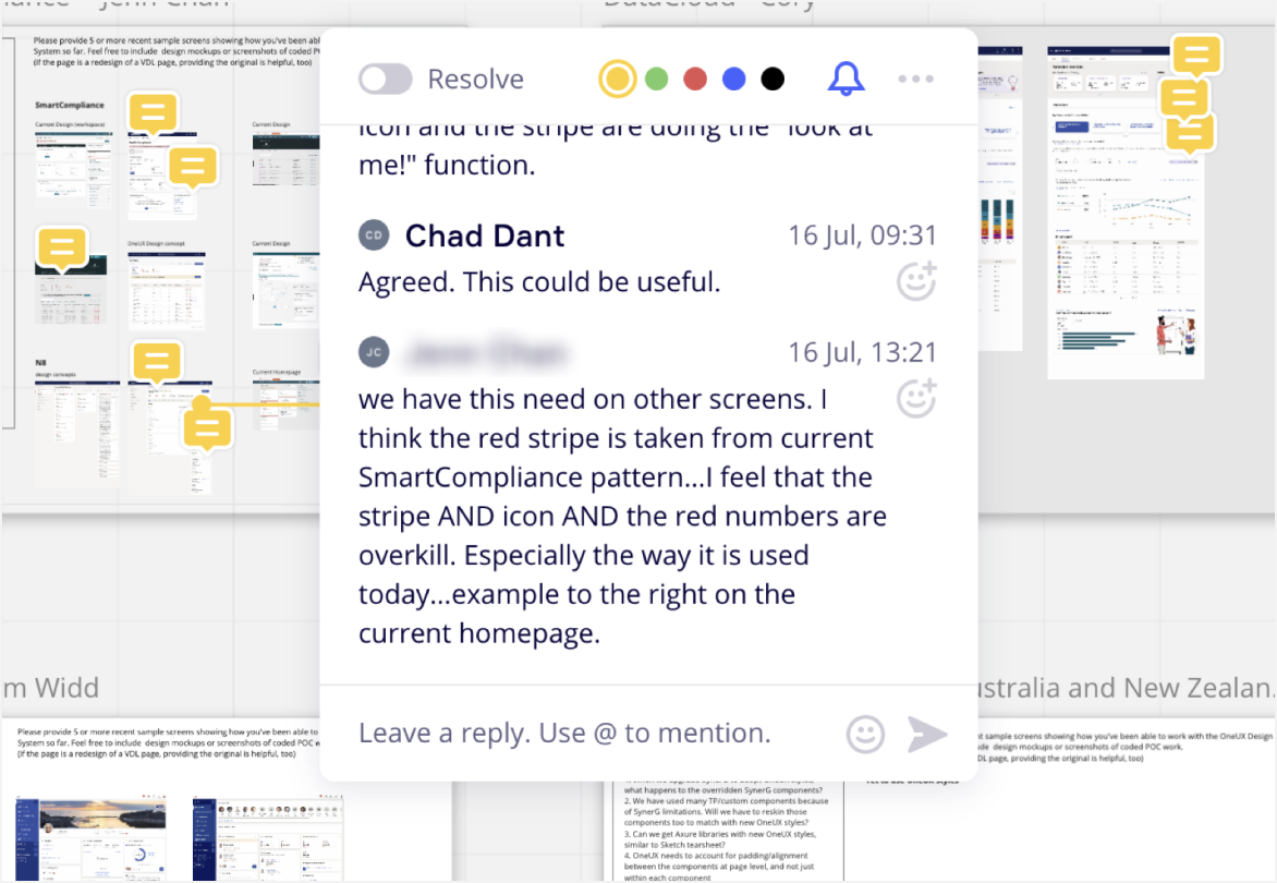
We were given a panel of designers, developers, and product owners and their participation was key. Throughout the trial period, we discussed feedback and found ways to converge thoughts, ideas, and opinions.
UI kit was shared to participants and tested in their products.
New designs were shared and discussed, creating quality feedback and collaboration.
Identified common patterns, layouts and design needs which drove the final vision deliverables
Cross-functional collaboration created positive morale and buy in
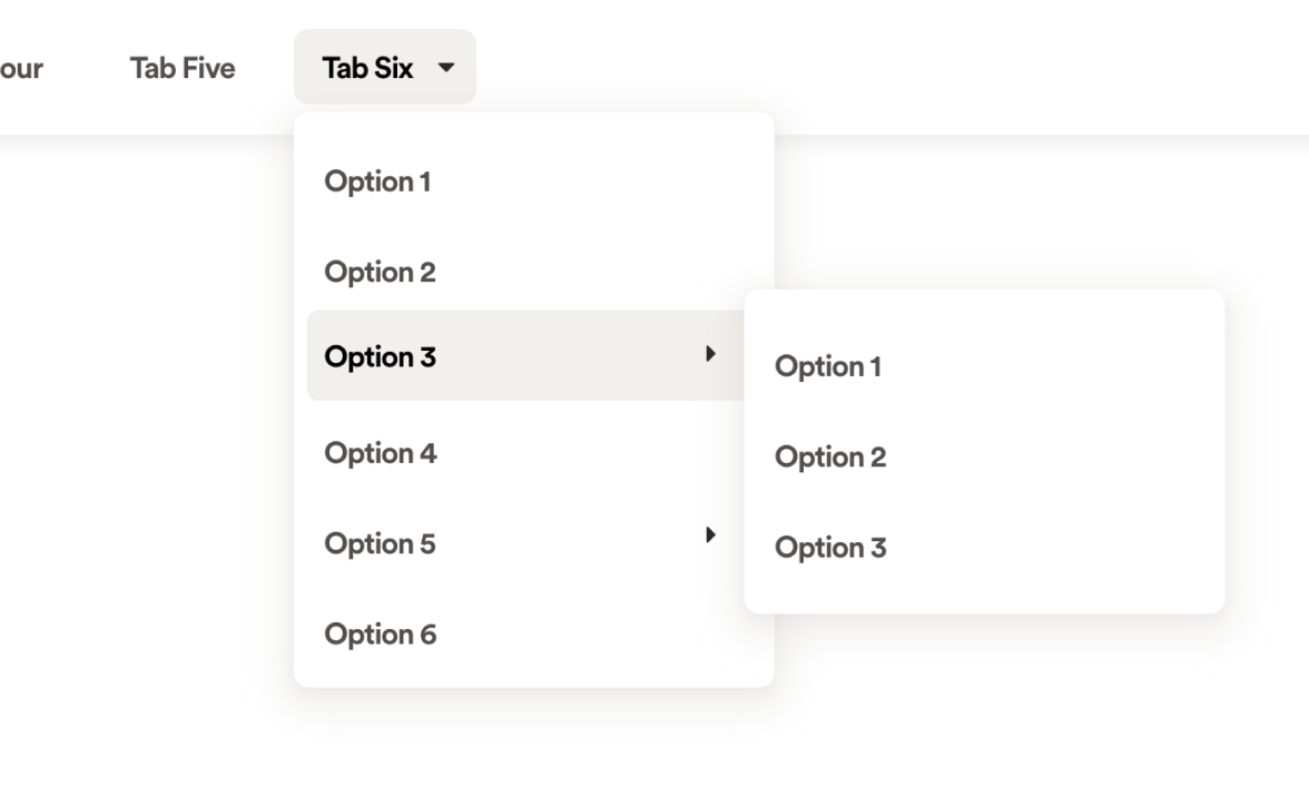
Discovered huge challenges with navigation
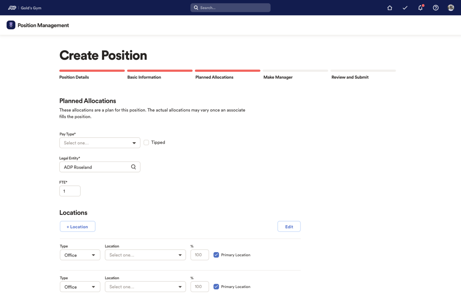
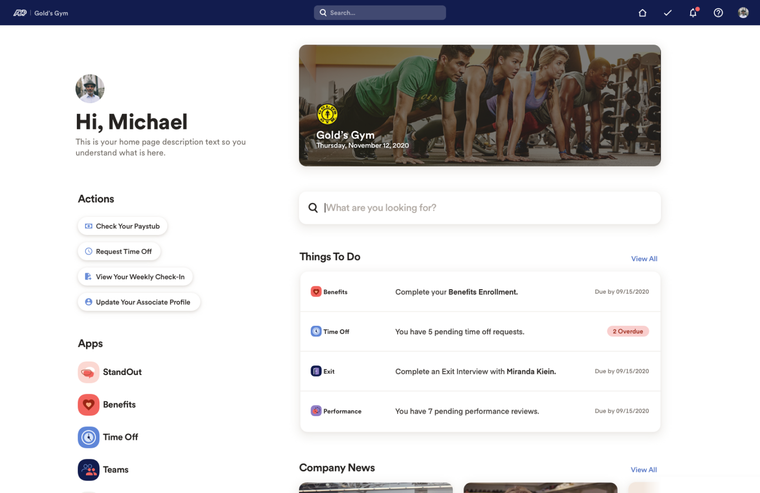
The ADP ecosystem had a variety of inconsistent and outdated experiences. Navigation and page layouts provided the biggest opportunity for creating consistency. With a lot of work and cross-functional collaboration, a new ADP brand bar and an set of page layout configurations were approved.
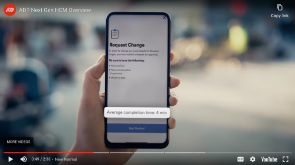
As the OneUX Design System grew, it was clear some components and patterns needed to change or include more variants. In some cases, new functional requirements had to be solved.
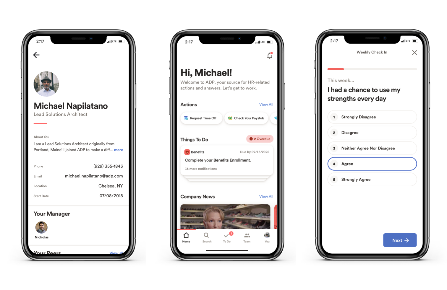
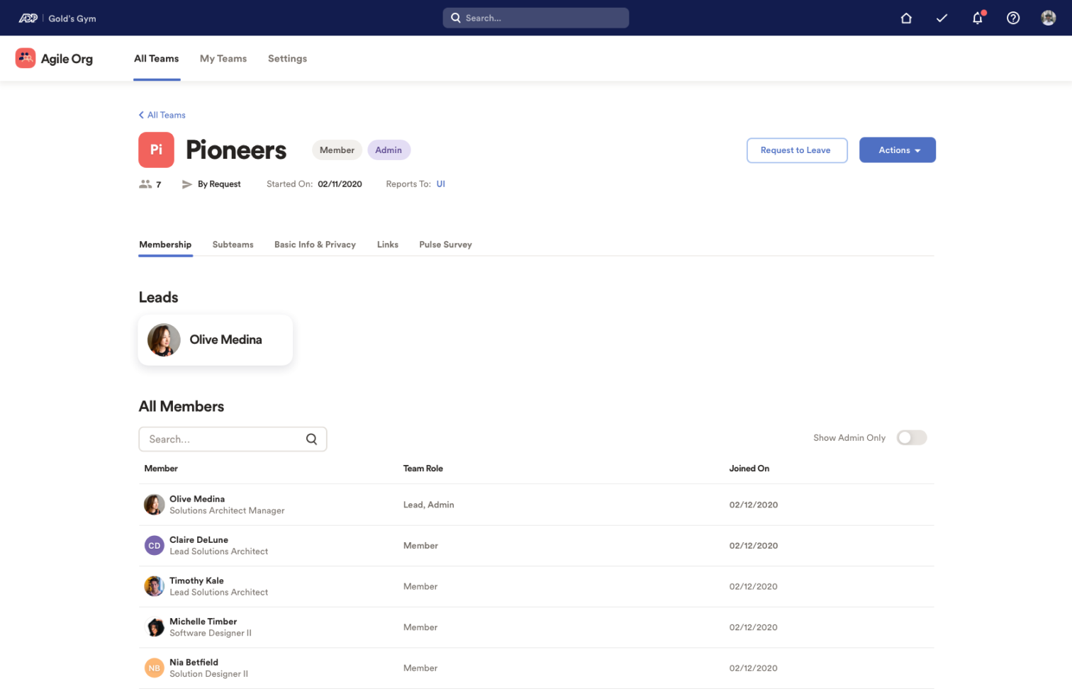
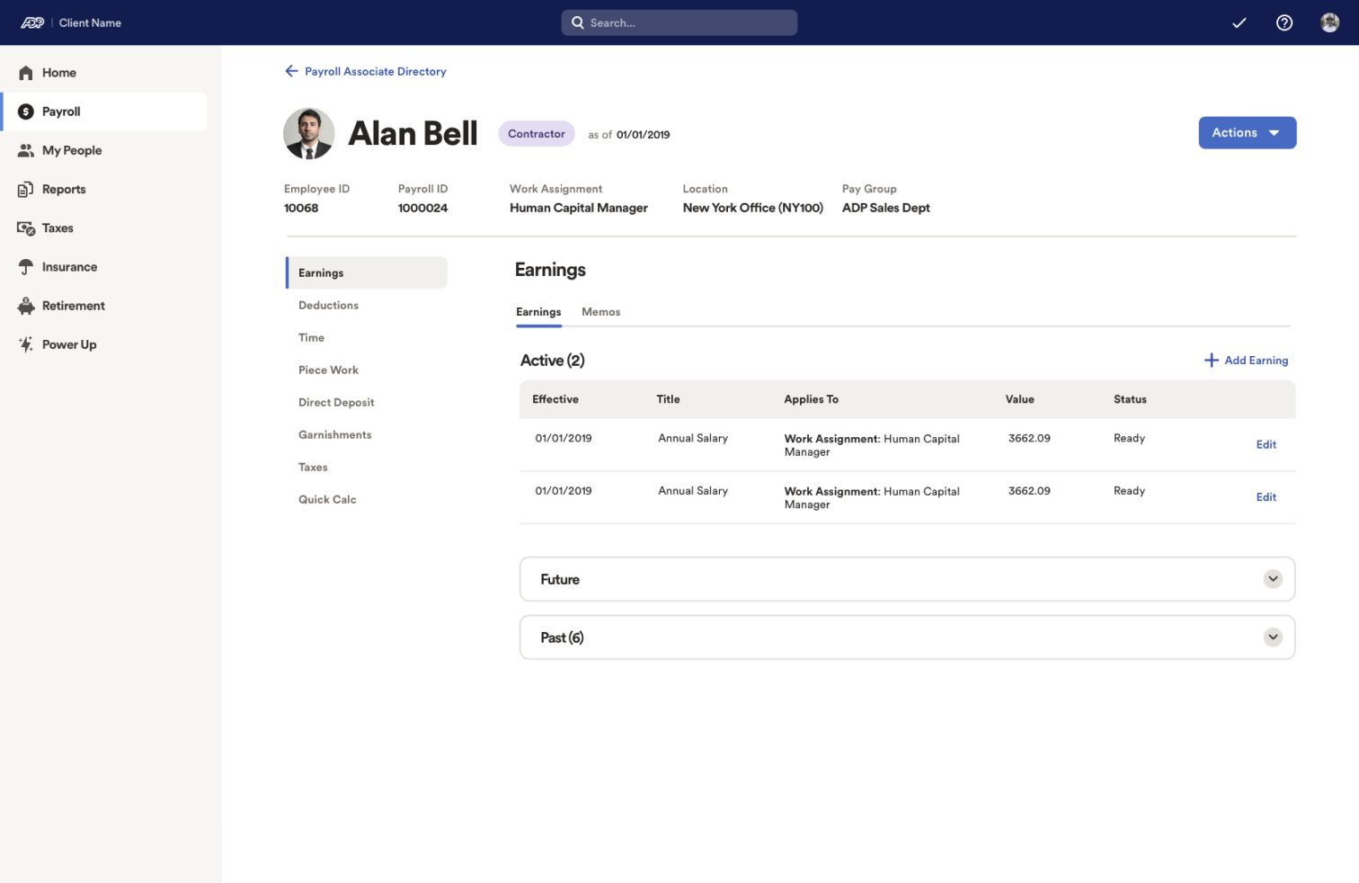
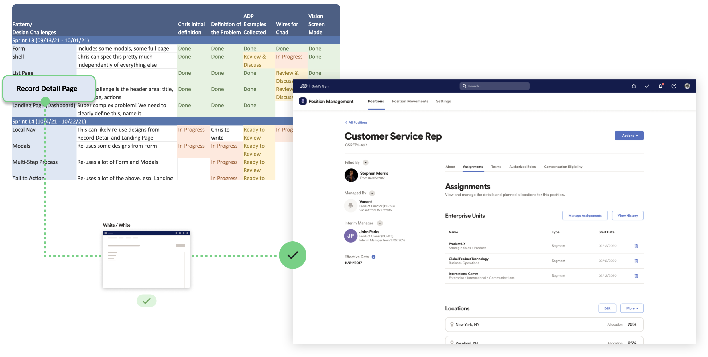
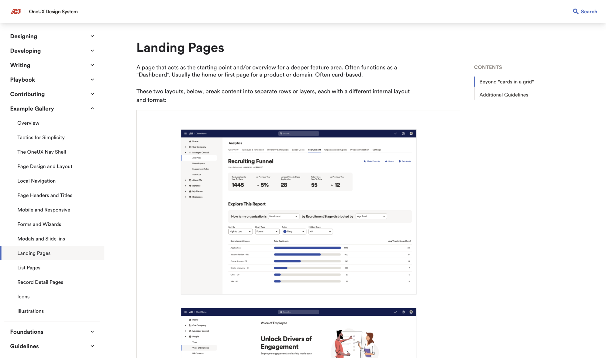
Using insights learned from team trials, we created a list of common patterns and page types to solve for. This collection will set the standard for product design at ADP.
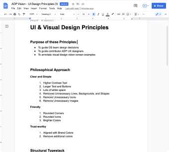
While working alongside designers and non designers, I learned their struggles. I helped them explore new ways of thinking about content, copy and interfaces.
• White background creates a cleaner interface
• Black text provides better readability
• Blue text is only for buttons
• Heading hierarchy provides a stronger layout
• Use icons more purposefully
• Friendly and welcoming page header
• Not everything needs to be a shadowed card
This Example Gallery provides inspiration, motivation and guidance for all designers across the organization.
Chad Dant, 2024