arrow_back
ANGEL STUDIOS: THE CHOSEN APP
A redesign that relieved user confusion by 84%
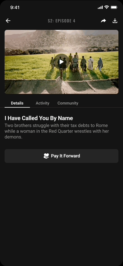
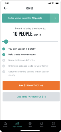
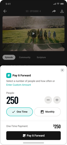
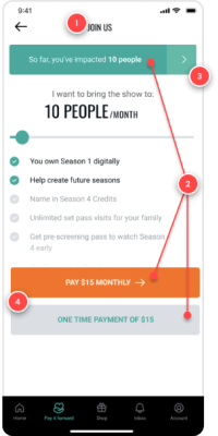
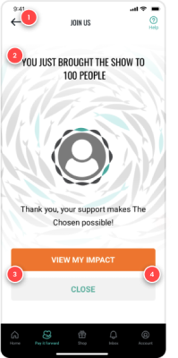
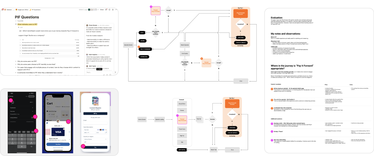
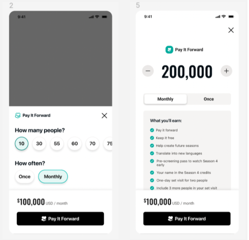
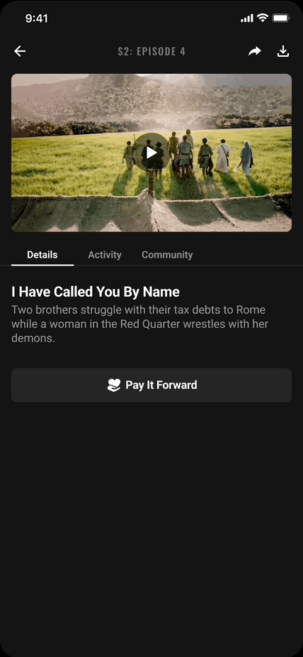
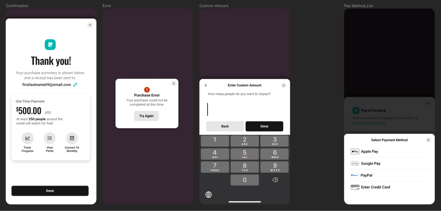
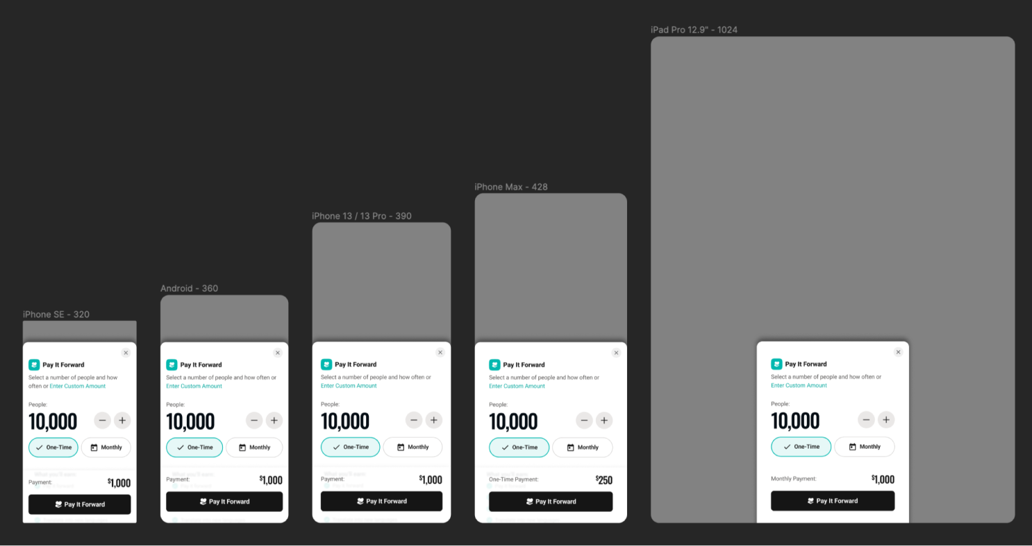
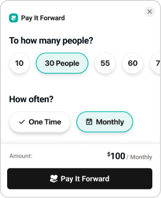
Pay it Forward is the primary mechanism of The Chosen App for receiving financial donations from its users. Customer support was receiving negative feedback resulting in a sizable increase of tickets. Analytics showed process abandonment, all of which results in revenue trending down.
Role
Sr. Product Designer
Team
Outcome Owner
UX Research
Developer
Deliverables
User Research
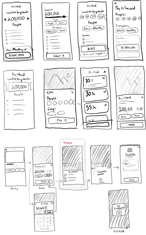
Sketches
Mockups
Final Specs
Prototypes
User Testing
Duration
3 Months
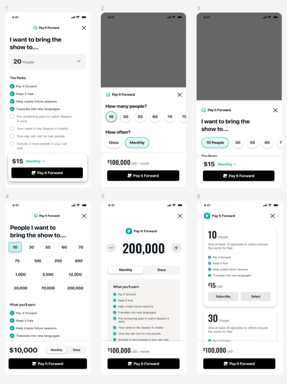
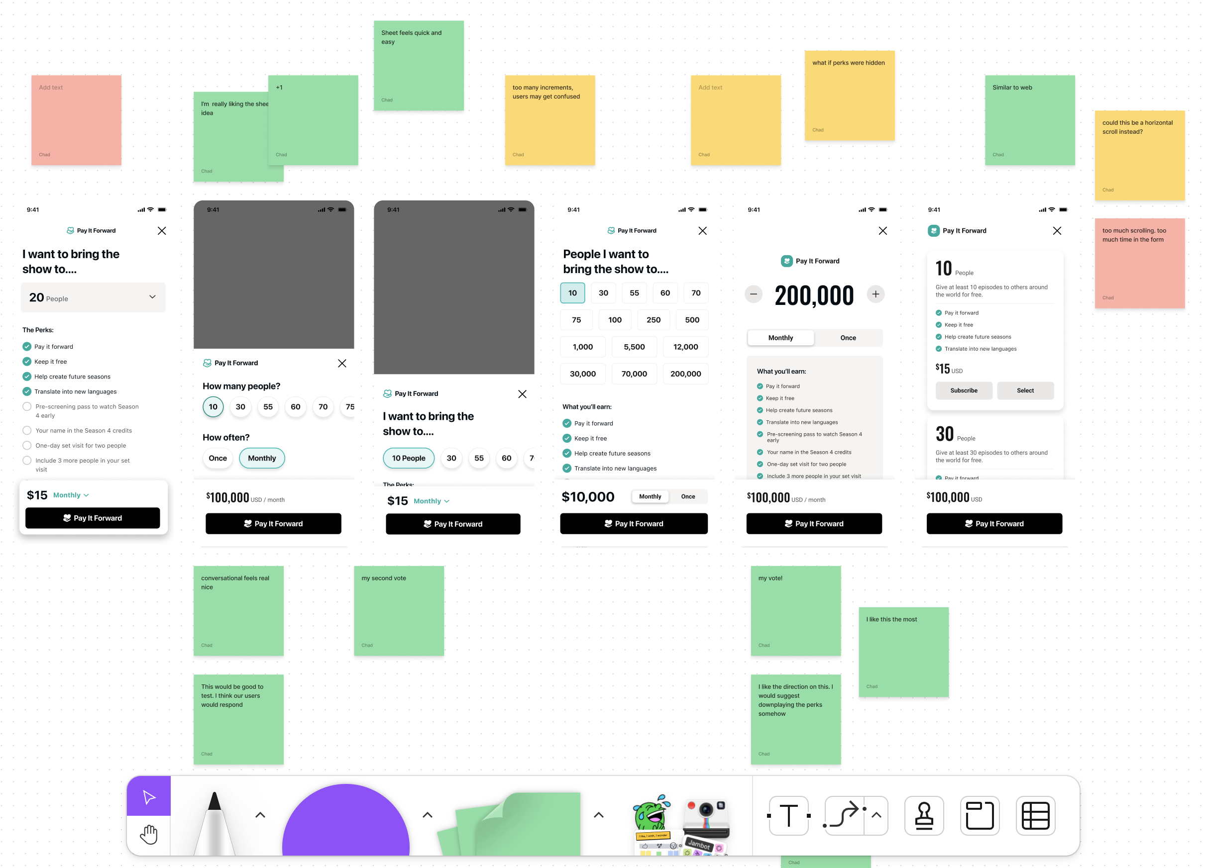

 Improve the visual design = Everyone was excited about the new direction.