Building more than just a streaming experience at Angel Studios
See where I led the watch experience in 2023.
Millions of users were migrated from the Chosen App and unable to find and watch other shows on the Angel Studios App. This led to reduced watch rates, inability to discover new content and a lack of engagement.
Role
Sr. Product Designer
Team
Outcome Owner
UX Research
Developer
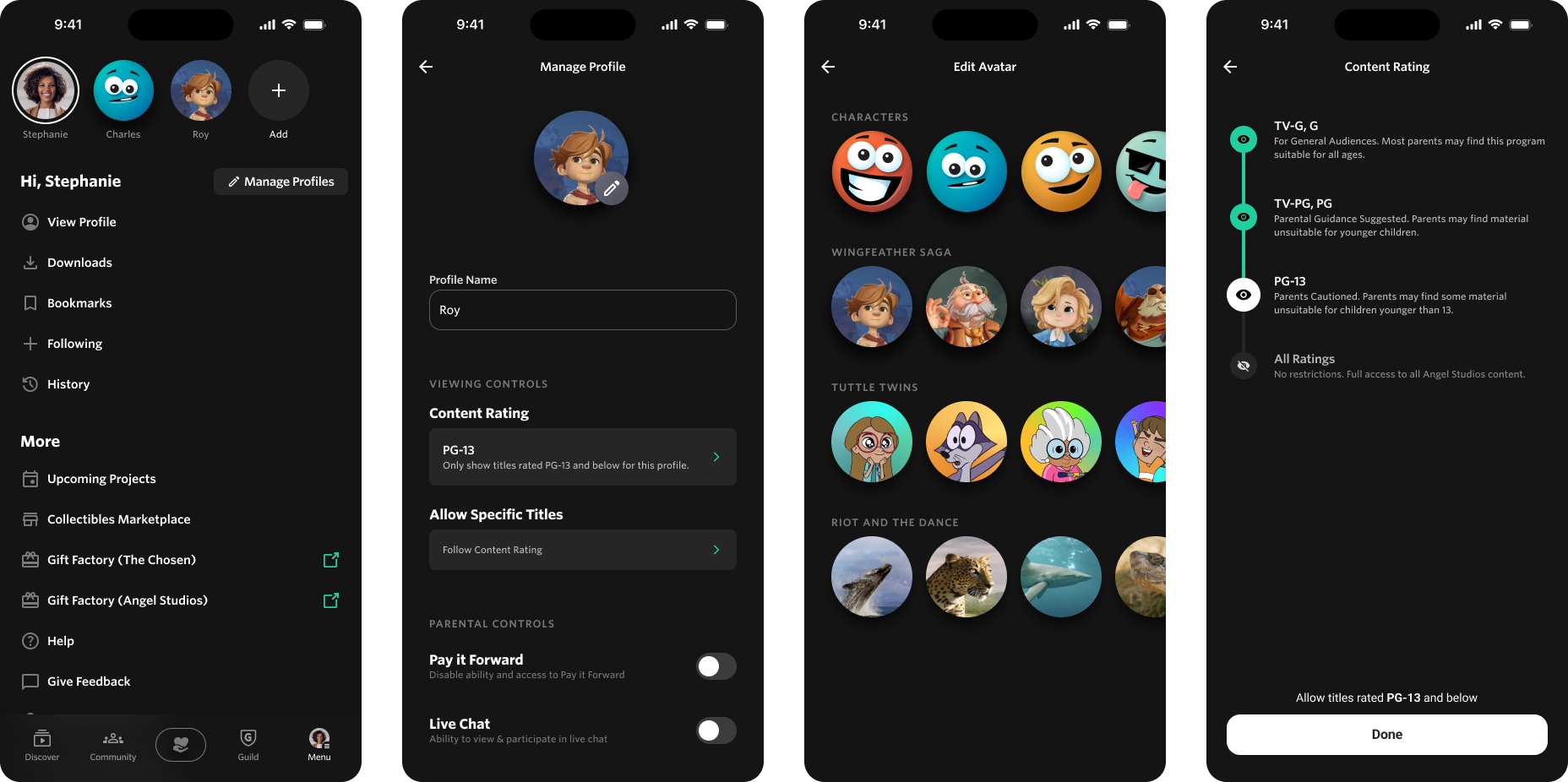
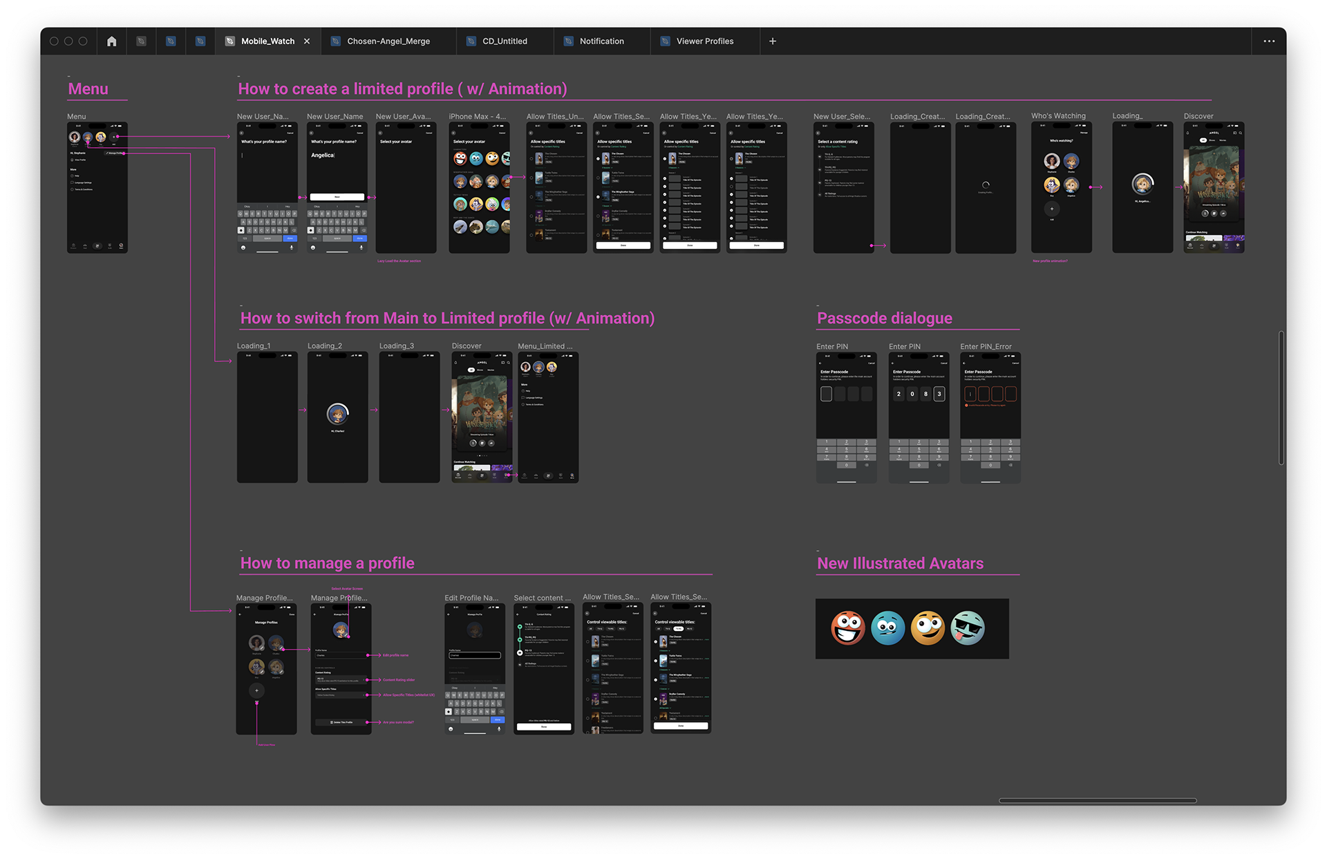
Deliverables
Competitive Research
Wireframes
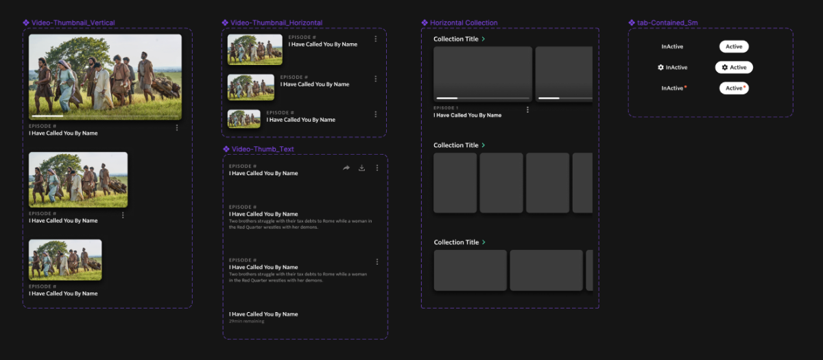
Components
Specs
Prototype
User Testing
Duration
2 Months
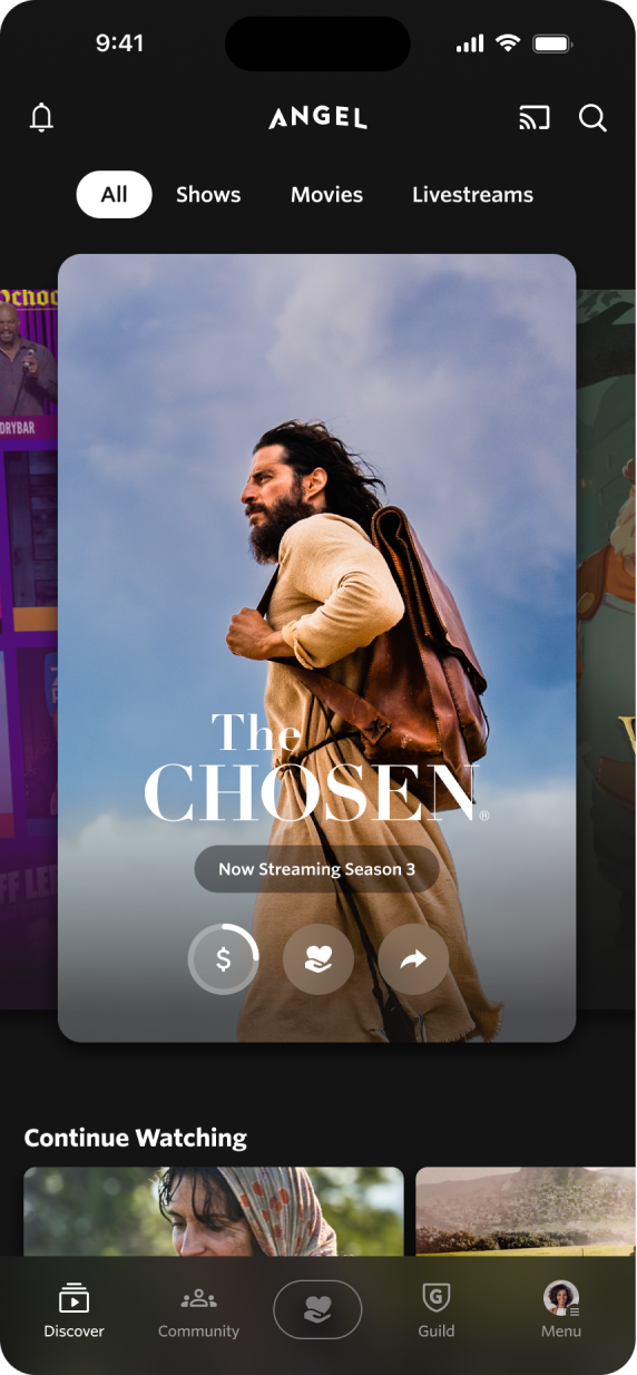
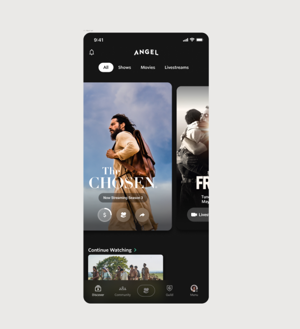
Before

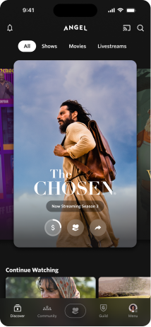
After
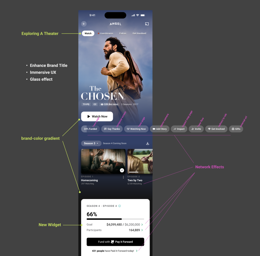
The landing page of the app did not give the user sufficient context and hindered their ability to explore the app.
• No navigation
• No access to other features
• No visibility of content library
• Provides little reengagement
I setup a comparison of the major streaming apps vs the Angel Studios app. The focus would be on identifying what could provide the biggest impact in increasing content discoverability.
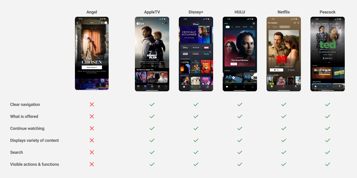
Navigiation
Continue watching
Display more content
Improve browsing
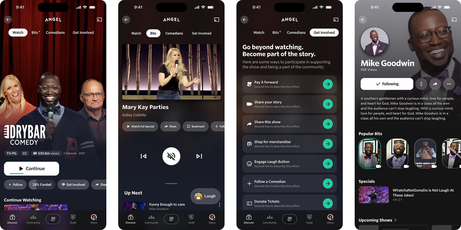
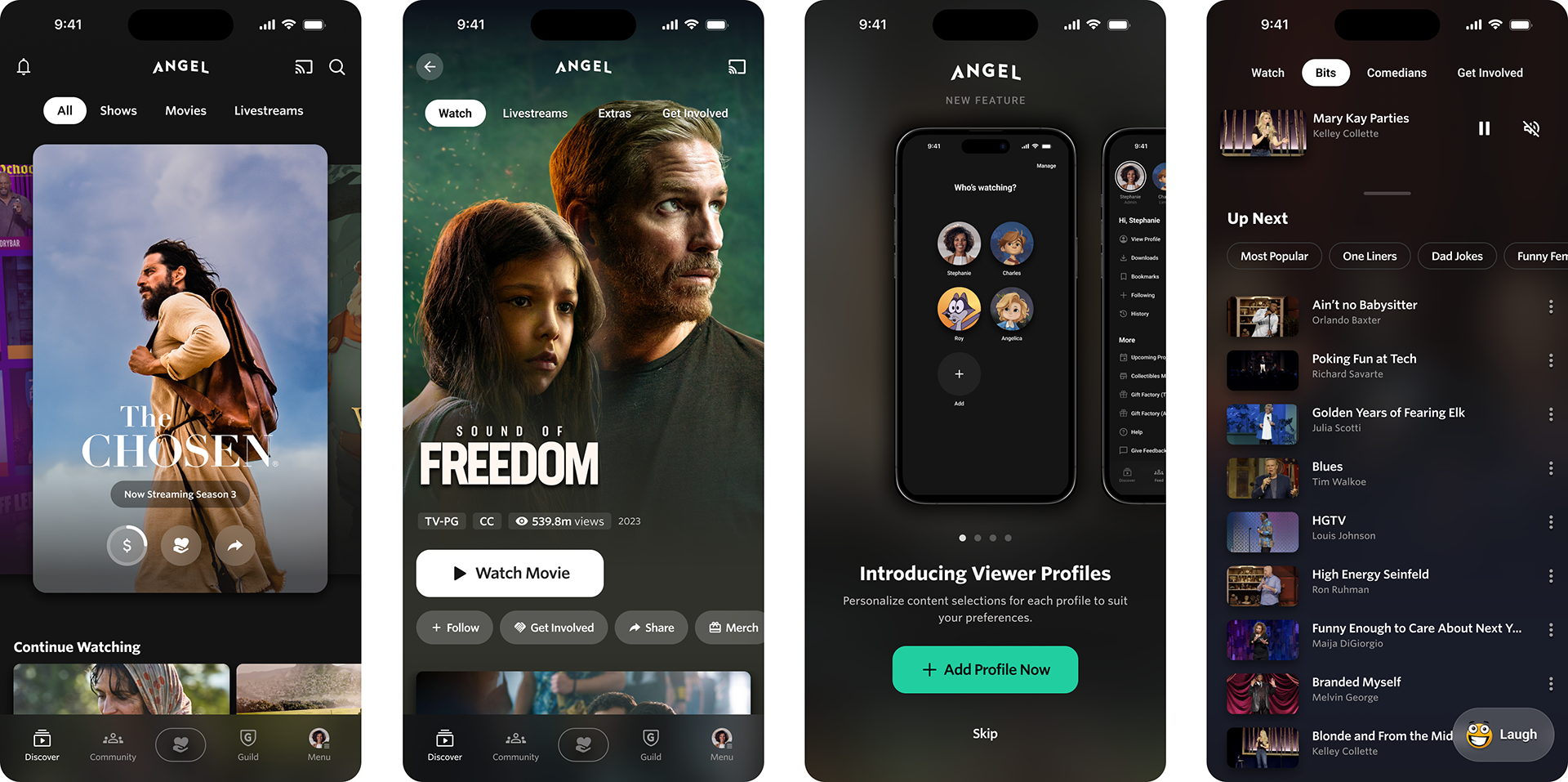
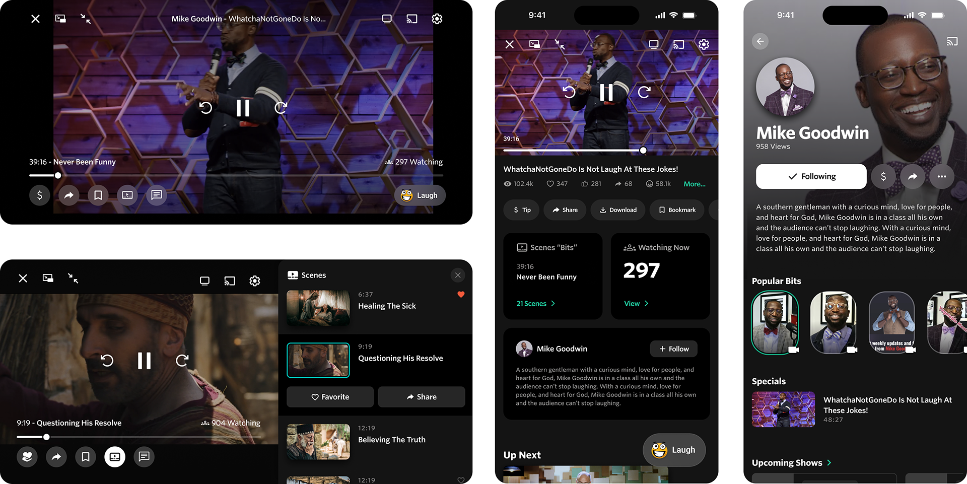
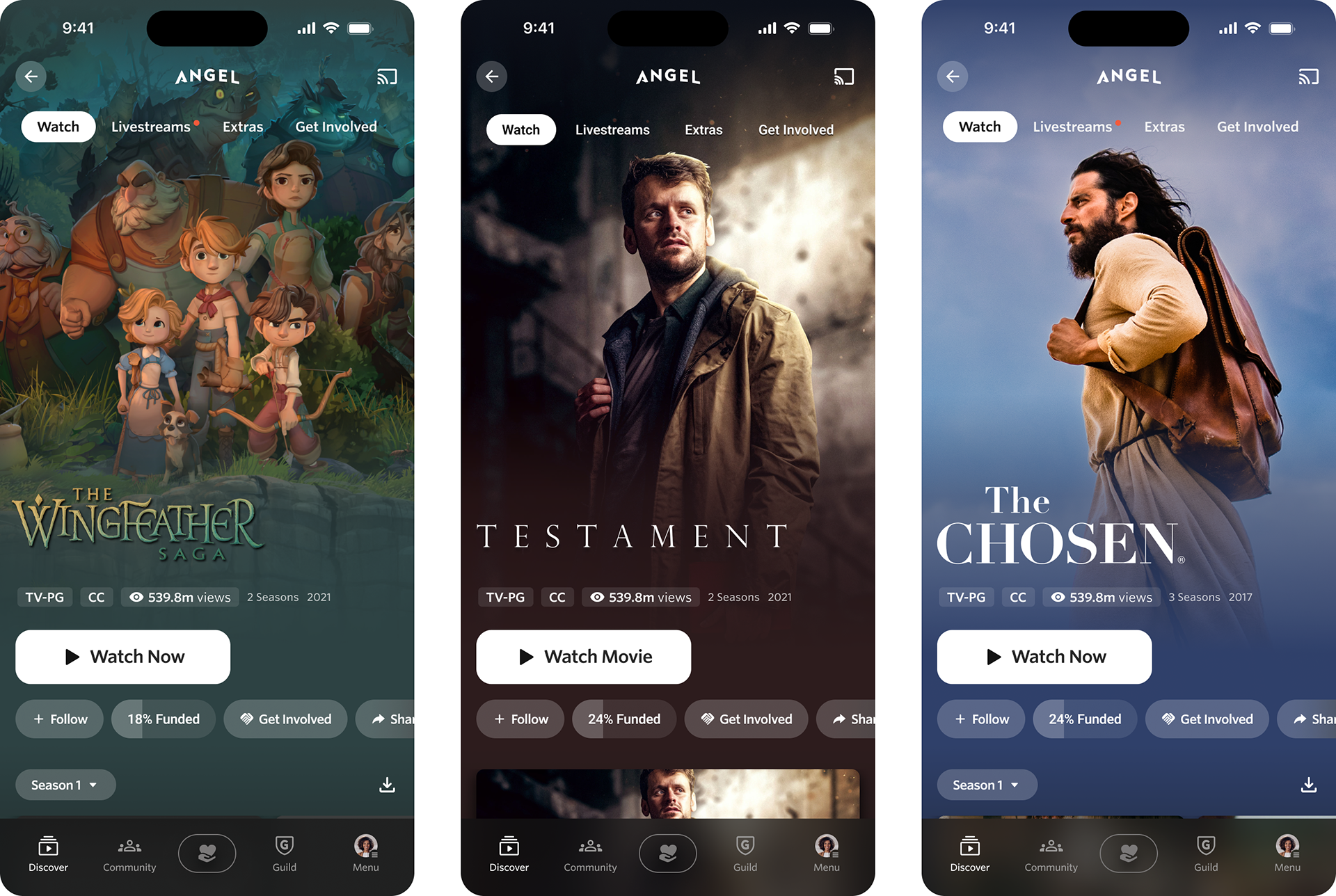
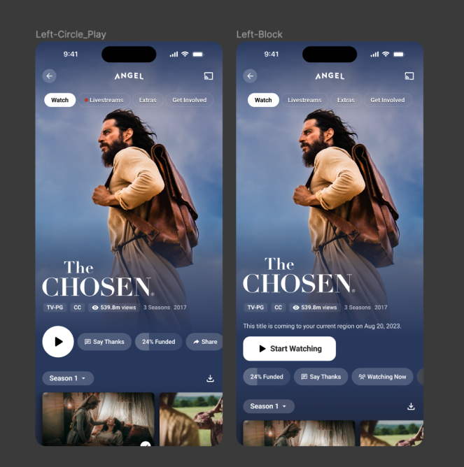
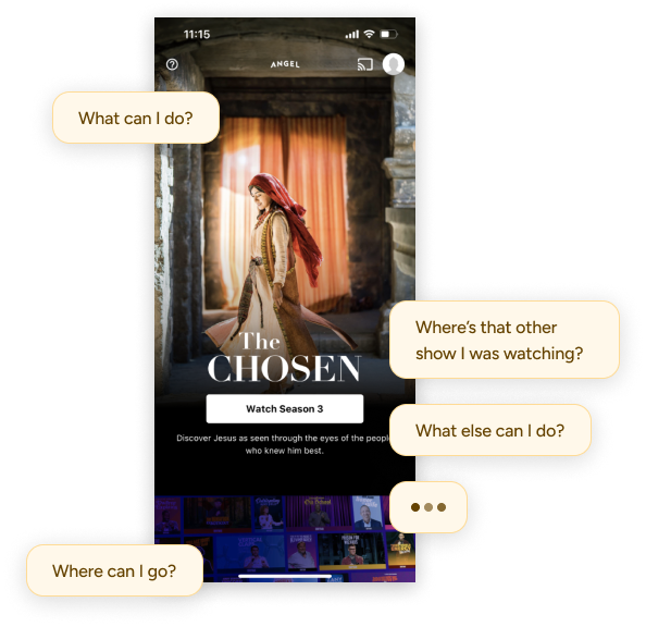
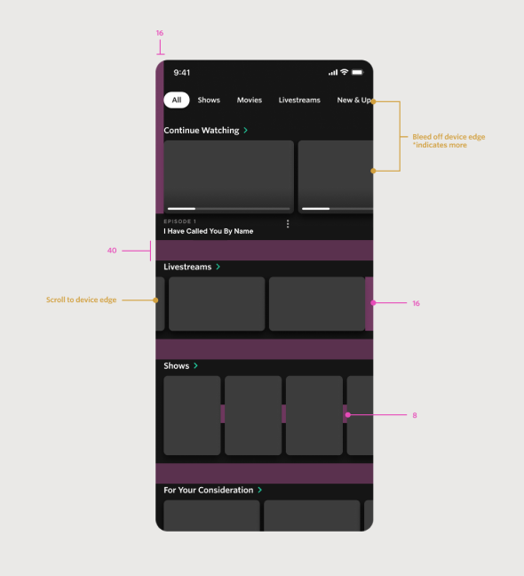
Using the high priority items that were found from the previous comparison, I started designing new layouts that were more intuitive and interactions that were more recognizable to users.
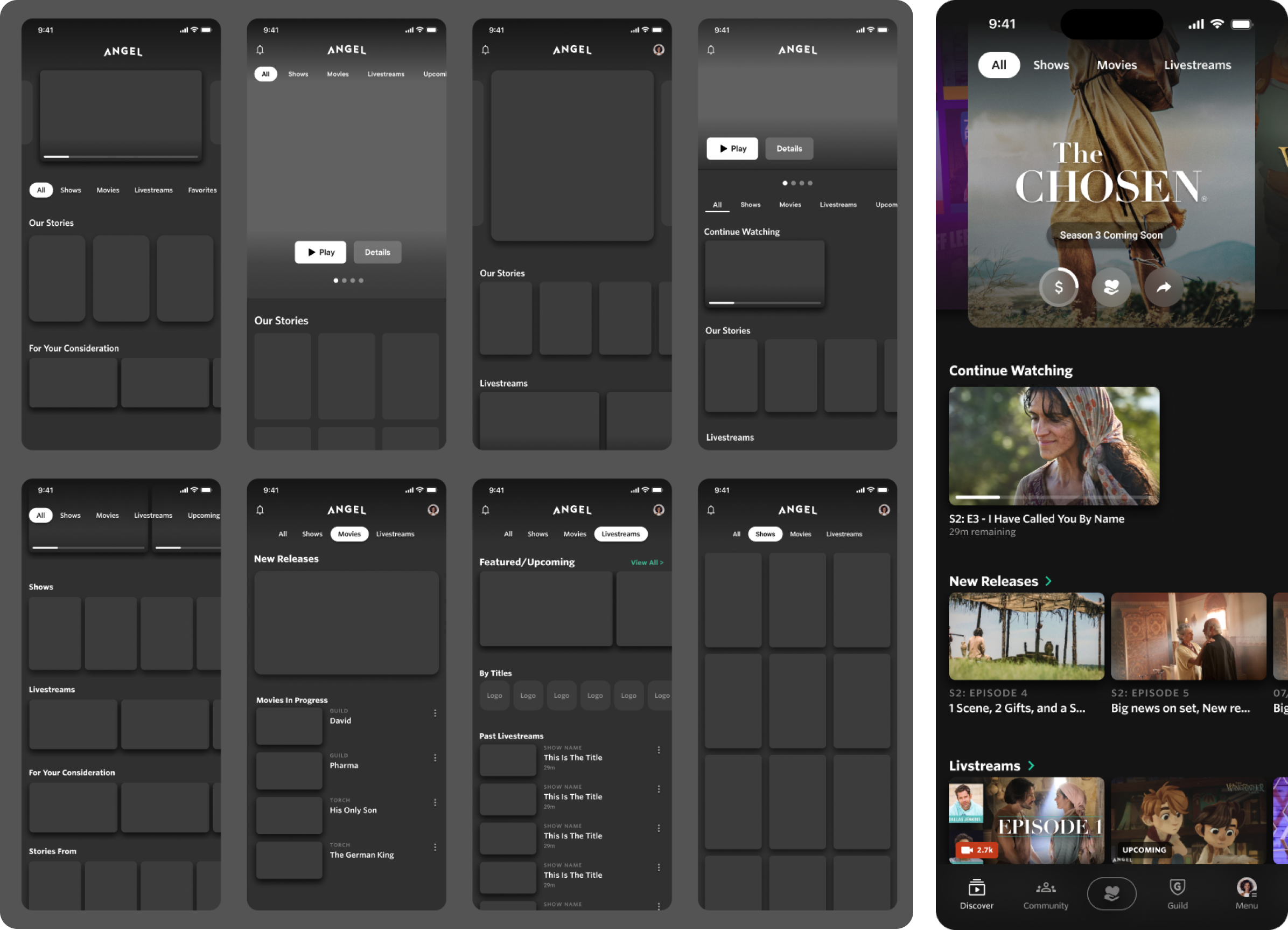
On the left are low fidelity wires exploring the landing page and top level tabs. On the right is a high fidelity concept which I shared to the team. (see next step)
Build a global nav
Added top level tabs to help exploration
Promotional carousel to introduce new and exclusive content
Use layouts that display more content and allow for scale
Group content using horizontal scrolling collections*
Leadership was against using horizontal scrolling collections despite it being a native browsing pattern on all major devices. I moved forward despite the pushback.
I had to take a risk of dropping a new design idea on the team during this time of migration. Things were tense due to the restructuring of many objectives and this was a push against the way we were doing things. And it worked!
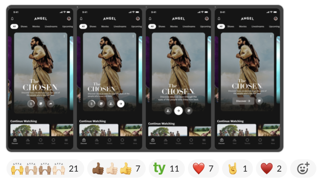
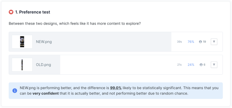
There was an immediate and overwhelming response of support and positive feedback. Questions did arise which would later be solved by scaling and iteration, but I was confident in this direction.
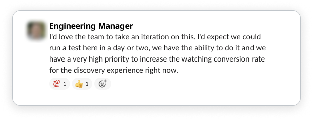
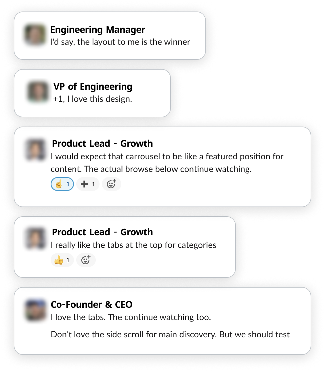
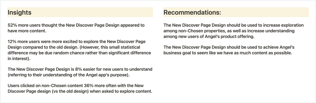
In both testing and experiments, the new design was definitively better.
Angel Guild Member

Chad Dant, 2024