arrow_back
ADP

Creating an illustration system that humanizes the HR product experience

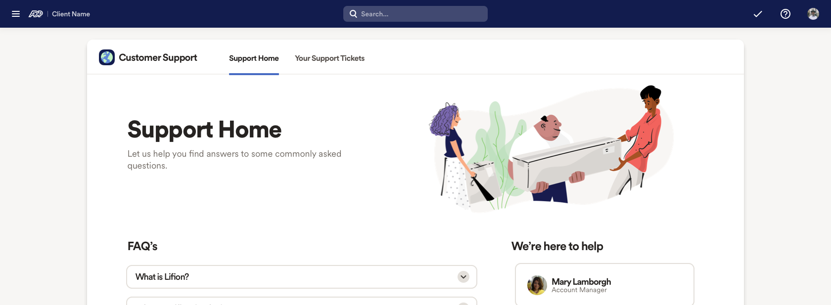
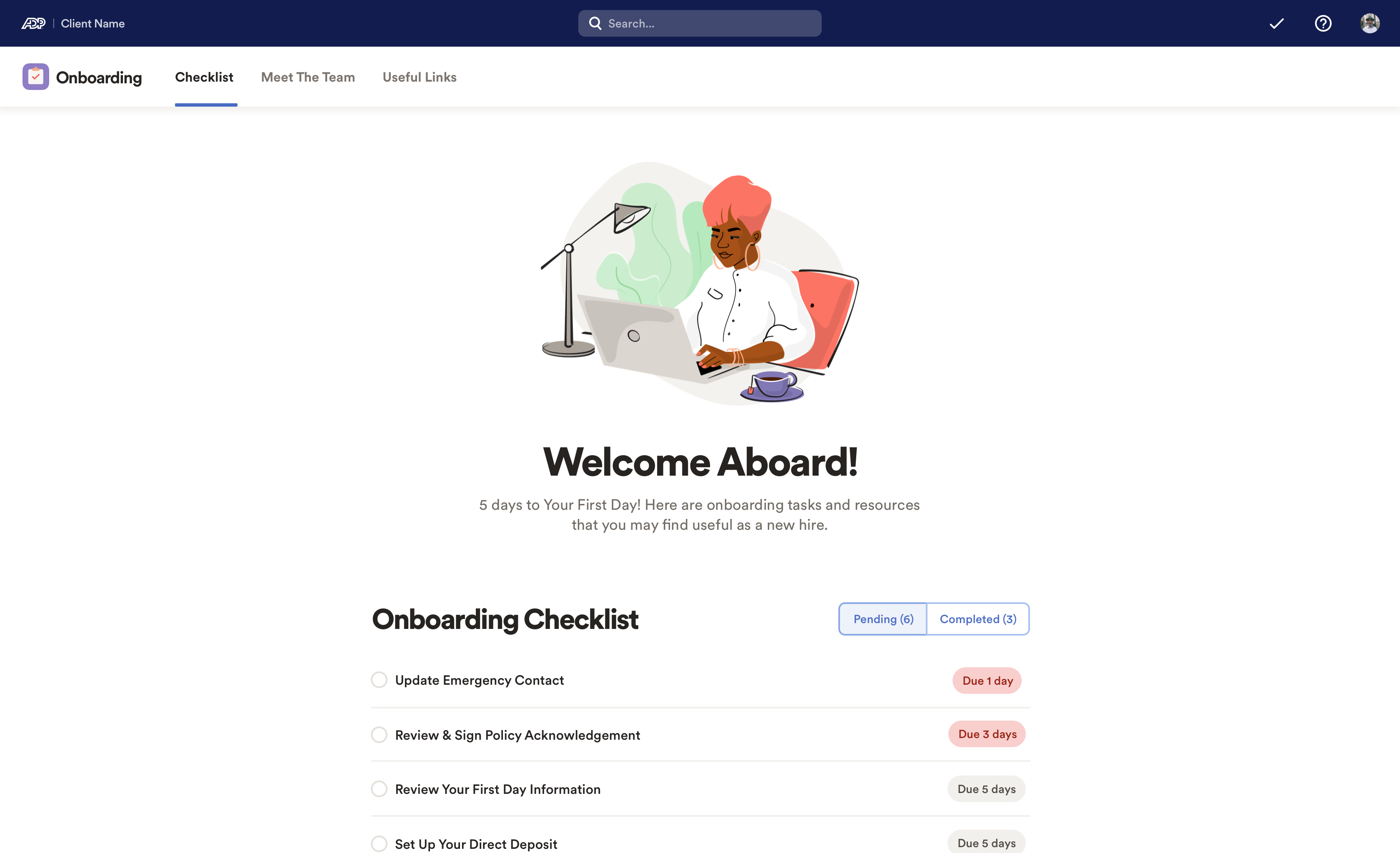
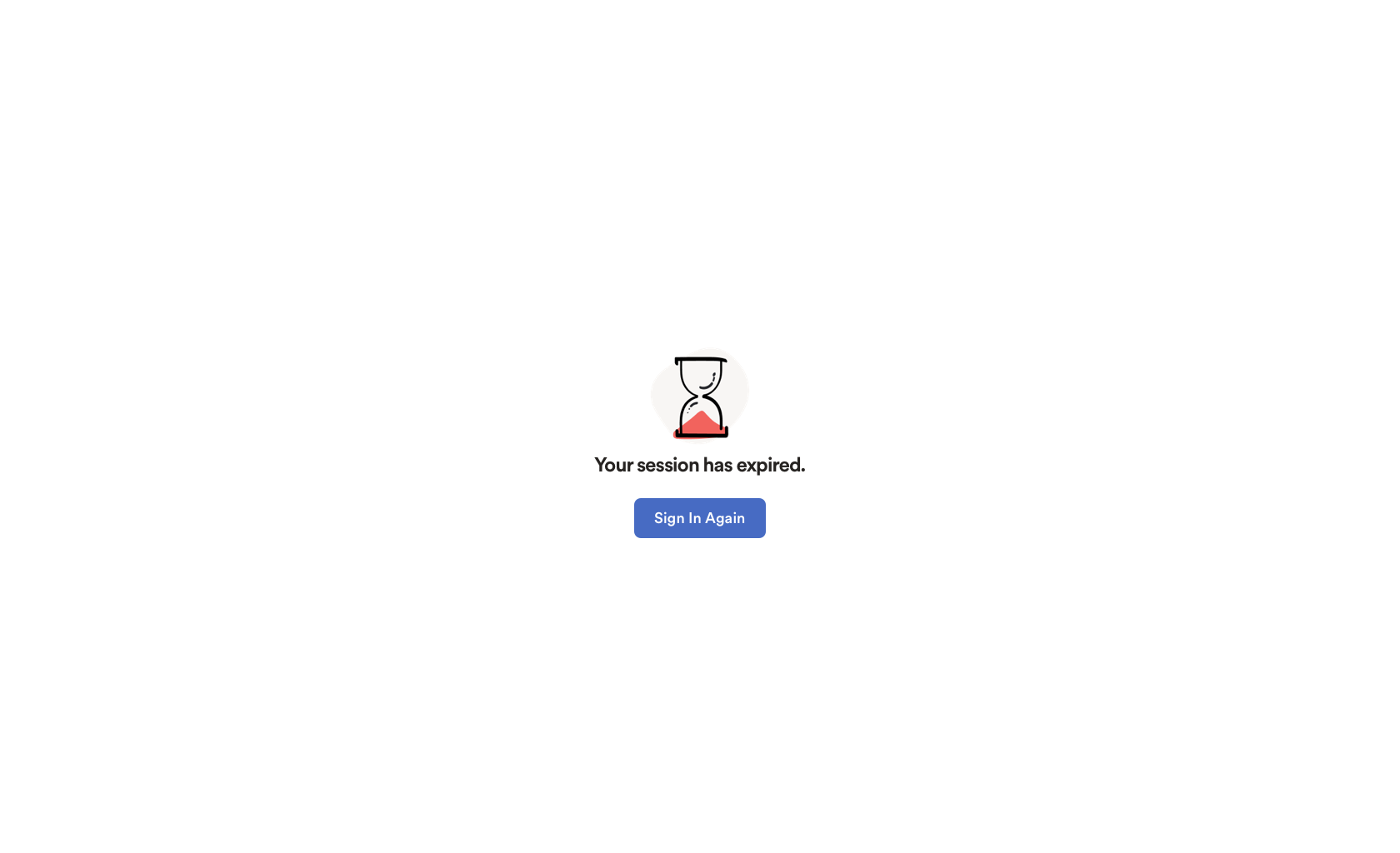
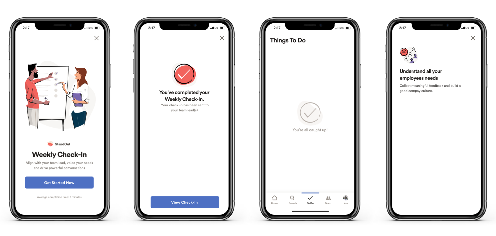
Some key product experiences lacked excitement and energy, and some left users with uncertainty. This systematic approach to product illustration solves these scenarios and more. The new style supports ADP brand, creates more delightful experiences, and plays a key role in marketing ADP products.

Image
Image
Image
Image
Image
Image
Image
Image

Role

Sr. Product Designer & Illustrator

Team

Director of User Experience
Design Systems Manager

Deliverables

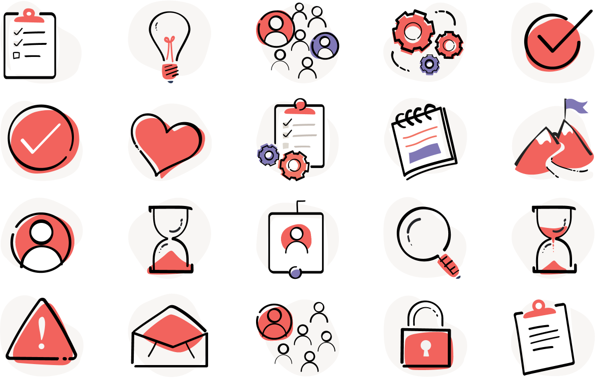
New Illustration Style
Illustration Library
Usage Guidelines

Duration

6 Months

Key objectives

palette

Incorporate brand elements

Align with and be inspired by ADP brand direction

stylus_note

Explore line work & shapes

Use a fresh, gestural styling that creates uniqueness and life

escalator_warning

Humanize characters

Draw people in more realistic and connectable ways

directions

Create usage guidelines

Deliver usage patterns and do’s & don’ts for successful adoption

Establishing it’s purpose

Product illustrations serve to incorporate a human touch into the user experience, conveying intricate concepts in a simplified and visually appealing manner.

heart_check

Show empathy

Say congrats, sorry it’s broken, everything is good

handshake

Be friendly

Make the app feel human and approachable

directions

Drive attention

Emphasize a feature, process or next steps

escalator_warning

Welcome users

Introduce users to a new space, feature or page

Spot illustrations

Spot illustrations will be used the most. They are flexible in size and pack a lot of punch. I targeted simple and strong line work with subtle gesture and splashes of key brand colors.

Pairing with text and buttons

I focused on the balance of size and visual weight between a spot and it’s associated heading. The key is not overpowering any functional elements like block buttons, text links or status indicators.

Empty states

The monochromatic grey style is key in communicating to the user that there is an empty or disabled state. This provides a clear understanding that a ‘lack of information’ is on purpose and the page load has completed.

People-focused illustration

Hero illustrations are for very exciting, high-traffic, user facing screens. This type of illustration is very much connected to the message of the screen via large header text. There should be a small narrative or story which echoes or extends the point and purpose of the screen.

The characters are VERY important because they are intended to have personality and story, because ya know…we all do! I explored with diverse skin tones, body shapes, sizes and individuality. Blob shapes are larger and encase the scene while artifacts and objects also can be added according to the story.

Usage examples

Below is a collection of screens which utilize acceptable usage patterns.

Usage patterns and guidelines

These guidelines will help ensure consistency and success when using illustration in experiences.

emoji_objects

Important!

Illustration will not fix a poor UI or UX. If a UI is very busy it will:

  • add to the visual clutter of the existing content

  • compete with the demand of the user’s eye

  • offer a divergence that could lead to user confusion or cognitive overload

Guidelines for ‘Spots’

A Spot Splash is meant to be used contextually and strategically within UI elements. This draws extra attention and emphasis to a thought or message and can be used to help encourage user behavior, provide confirmation or support.

Guidelines for ‘Hero’

The purpose of a Hero is to absolutely demand the users attention. The attention could be directed to an important CTA or a new feature or function. Hero illustrations will deliver a fun and exciting story that compliments the reason for the user being there.

Please don't

Illustrations can be fun and add so much value to UI & UX. HOWEVER, doing it incorrectly will certainly draw the WRONG attention to your product. Avoid these mistakes.

Welcomed results

User Experience

Illustration humanized our product, creating more delightful and friendly experiences.

Production

Product owners, designers, and marketing immediately began elevating their products and features.

Business

ADP uses these illustrations in product demos and commercials.

Chad Dant, 2024